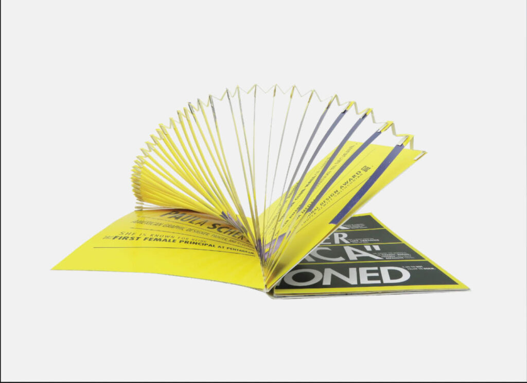
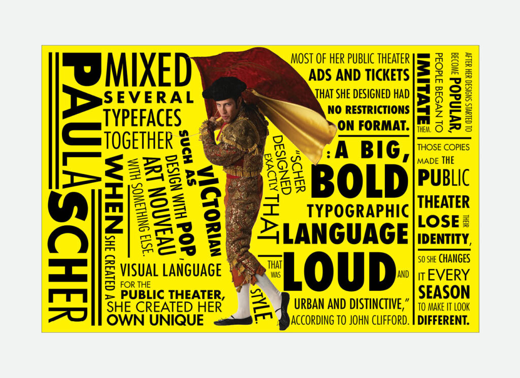
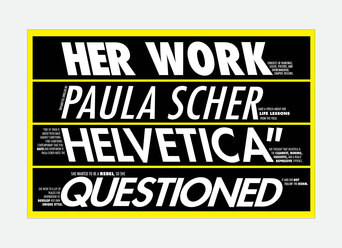
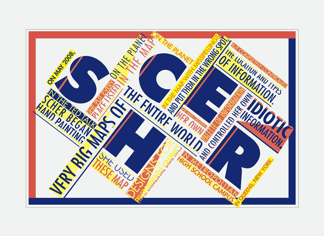
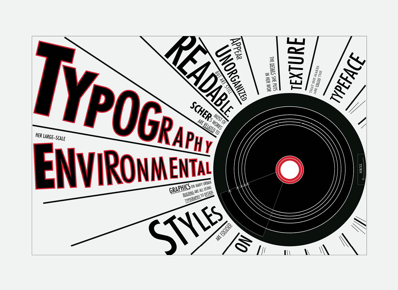
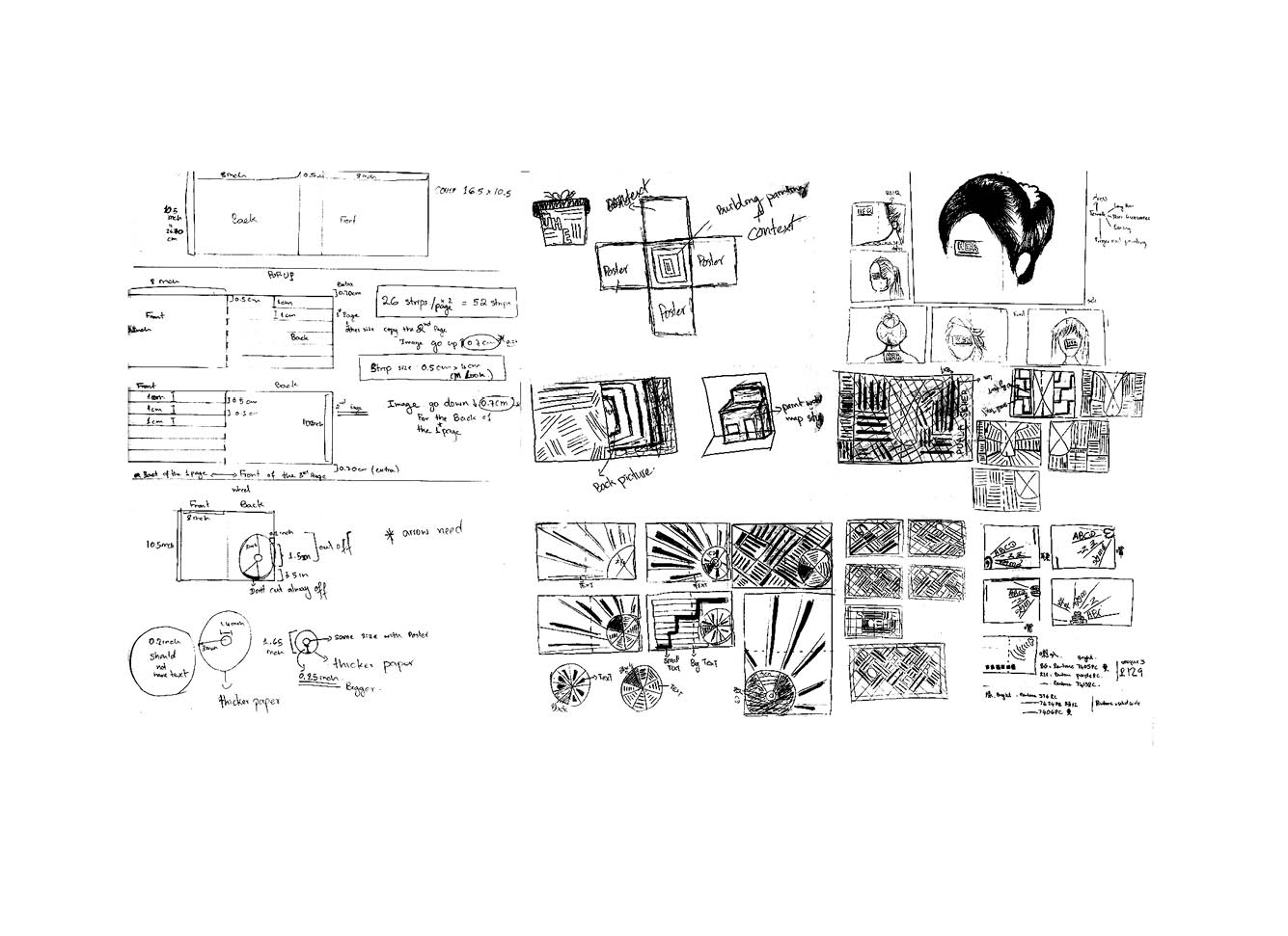
The purpose of this project is to create the content, both copy and visuals, that exemplifies the nature and style of a designer. I needed to choose a designer and study the processes as well as the creative sequence. I chose Paula Scher. Her works are urban, big and loud. She is also an environmental graphic designer, so I created a pop-up card for the first page. I used Futura font in this project because Scher likes to use sans-serif font, but Helvetica font. Futura has a big sans-serif family font and it helps my designs similar to Scher’s designs.